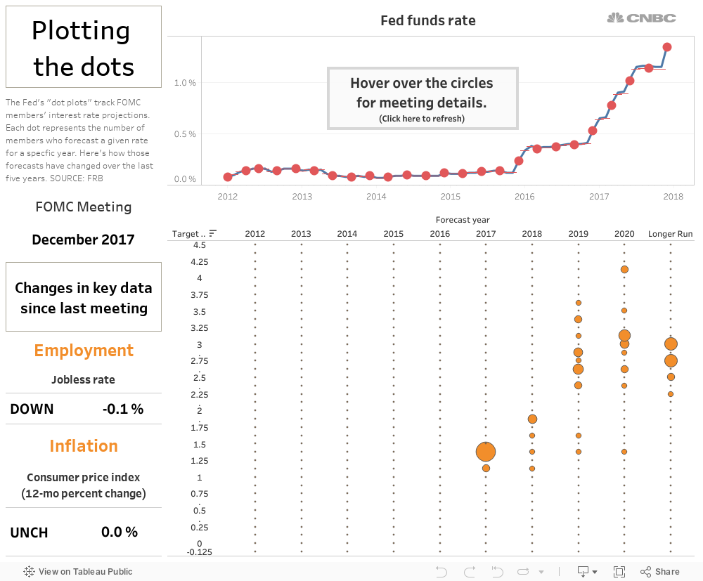
To understand where the Fed thinks interest rates are headed, you have to connect the dots.
Four times a year Federal Reserve policymakers at the Federal Open Market Committee submit their projections about where short-term interest rates are headed. The results are the central bank's so-called dot plot — a visual representation of how many members think rates will hit a given level over the short, medium and longer run.
The charts, which the Fed began publishing in 2012, have become a series of tea leaves that many investors like to read for hints about what the FOMC will do next. But those tea leaves can be hard to read in isolation.
To give a better view of how the Fed's thinking has changed over time, we've plotted the changes in the dots over the last five years, along with the key economic data policymakers had to consider at each meeting.
Here are five years of "dot plots" in one interactive chart, including the most recent projections released Wednesday.