A lot of folks are parsing the latest S&P Case Shiller home price report out today, and debating whether some month-to-month increases are proof of home price stabilization nationwide. I frankly think it’s impossible to say anything nationwide, because a lot of different markets are reacting very differently. That may seem an incredibly prosaic thing to say, but I think an awful lot of smart folks often lose sight of that.
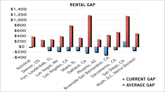
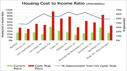
I want to focus today on a couple of charts I got from John Burns over at John Burns Real Estate Consulting. He chooses to look at affordability and the Rental Gap (that is how much more or less it costs to own versus to rent) as better indicators of price direction.
First, take a look at the Rental gap: