

There's been a big change recently in the way the market values emerging market (EM) currencies. Here are three graphs that explain a good part of why these currencies have been falling. They may give us some clues about which ones are likely to be vulnerable in the future.
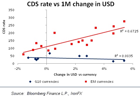
The first graph shows the credit default swap (CDS) rate of each country compared to how much the dollar has risen vs that country's currency over the last month.
You can see that for the 16 EM currencies shown here (the red dots), the relationship is quite close: the dollar has risen more against those countries with a higher credit default swap rate. Speaking technically, the R2 here is a rather high 0.67, meaning that the change in the CDS rate explains 67 percent of the movement in these 16 currencies against the dollar over the last month. That's pretty good.
(Read more: Are emerging markets facing an 'abyss'?)
What this shows is that investors have been fleeing risk. They've been getting out of countries that are considered risky, because they worry that as the Fed tapers off its quantitative easing, money will become scarcer, interest rates will go up, and these countries' problems will get worse.
Notice too, the blue dots and the blue trend line. These are the G10 currencies. Their trend line shows no relationship at all – the R2is close to zero. So risk is only a concern for the EM currencies.
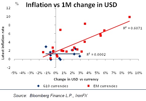
Next is inflation.
Looking at the red dots, you can again see an excellent correlation: generally speaking, the higher the country's inflation rate, the more the dollar has appreciated against the currency.
That's because countries with higher inflation will have to raise their interest rates more, and that's likely to slow the economy and therefore discourage inflows of money into stocks or direct investment.
(Read more: Goldman downgrades emerging Asia currencies)
The R2 for the red line is 0.61, which again is very high. And again, the story is totally different for the G10 currencies: their performance shows absolutely no relationship with inflation.
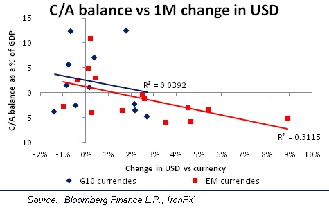
Finally, here's a graph of each country's current account balance as a percent of GDP and the change in the dollar.
This factor makes a lot of sense. Investors are worried that as the Fed pumps out less liquidity to the markets, countries with current account deficits will find it harder and harder to attract the capital necessary to cover their international deficits.
Again, the relationship is much tighter for the EM currencies than it is for the G10 currencies. As usual, there's almost no relationship with the G10 currencies.
(Read more: A big risk that may catch the Fed off guard)
However, that's largely because of the huge current account surpluses in Norway and Switzerland.
When I eliminated every country with a current account surplus over 10 percent of GDP, the R2 for the EM countries fell somewhat, but the R2 for the G10 currencies rose to 15 percent – not particularly high, but higher than zero. So this is one factor that's affecting both the G10 currencies as well as the EM currencies.
(Read more: Emerging market rout fueling riskier Asia bets: Citi)
In short, these graphs show the EM currencies that have fallen the most are the risky countries with high inflation rates and those that need to attract capital to finance their current account deficits. This makes sense as investors worry that as the Fed cuts back on its supply of liquidity to the market, there will be less money to go around and it will cost more to get it.
We also learn that these factors aren't big worries for the G10 currencies,perhaps because there's not that much difference in how these countries measure up on these metrics. It's somewhat different for current account deficits,however, perhaps because there is more difference among the countries on this measure.
Countries in trouble
Let's look now at which countries are in trouble. For the CDS rates, the riskiest countries are Indonesia, South Africa, Turkey and Russia, in that order. For inflation, it's India, Turkey, Brazil and Indonesia. And for current account deficits, it's Turkey, South Africa, India and Chile. We can easily see from this list why India, Turkey, Indonesia and South Africa have seen their currencies collapse recently, and why it will be so hard to get them back on arising trend again. Turkey is among the worst off in all three categories –that's probably the currency hit a record low recently. The others are among the worst in two out of the three categories. I would recommend avoiding these currencies or being short until we see some improvement in their fundamentals.
(Read more: First India, then Indonesia.. who is next?)
As for the G10, it's noticeable that the currencies with the widest current account deficits are two of the commodity currencies – NZD and CAD – and GBP. This analysis suggests that these three currencies are likely to underperform the other G10 currencies as investors move their money out of the riskier EM currencies and into safer G10 currencies that don't have the same problems of the EM world. I think investors looking for currencies to sell should consider these three.